


The Unravelling of Betty Draper

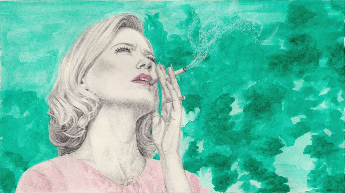
What struck me first was this low angle shot of Betty Draper. Something about the graceful line of her neck, jaw and chin made me go “oooh, I think I want to draw this.” The incredible bone structure of January Jones also probably had something to do with it.
What started as one illustration then became a short comic of sorts. Why? Good question, my memory refuses to divulge the information. I suspect either because context makes this shot even better, or because the whole final scene is just too good.
*Spoilers ahead for a show that finished airing 10 years ago. Go watch it now if you haven’t!*
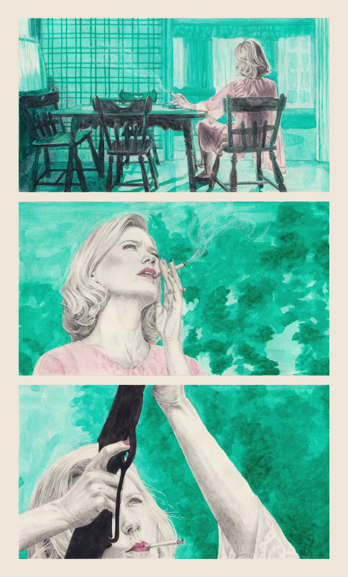
Set to the soundtrack of Bobby Helms’ My Special Angel, the two scenes—Betty in her kitchen, then in her garden—give a sense of oppression followed by release. And, let’s be honest, badass-ness.
The first scene sees her bored senseless at 1pm, disillusioned again about her role as a housewife. She’d briefly tasted a sense of freedom, if not purpose, through a couple of photoshoots as a model.
After a morning of renewed optimism at doing the house chores, we find her sat at the kitchen table, cigarette in hand. She’s still in her nightgown, though her hair is perfect as always. A beautiful shot, conveying both boredom and oppression. In the background we start hearing My Special Angel, barely perceptible.
In the next scene the song is loud enough to be heard clearly. Betty’s outside, looking up at the neighbour’s pigeons flying around. Soon after she brings the shotgun into frame and starts shooting at the birds, while the neighbour shouts “Mrs Draper!” We have the release.
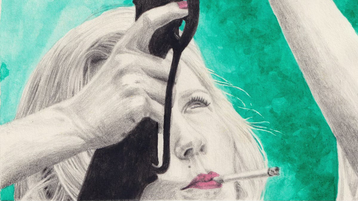
Although I’m not the biggest fan of Betty, my interpretation of this ending is sympathetic to her. Being constantly gaslit by her husband and stuck at home all day, I think she’s taking control in her life where she can. In this instance, by doing to her neighbour’s birds what said neighbour had threatened to do to her dog: shoot them. Or maybe she’s just trying to scare them away, so they can roam free without having to come back to their cage. Something she’s not allowed to do.
Can you tell I love this show?
Process
Once I’d chosen which stills from the show I wanted to draw, it was mostly a matter of sketching and rendering them through a limited colour palette.
I’ve been loving the mint green/rose combo for a long time and now was the time to use it. I stuck with my idea of mixing graphite pencils and watercolour, which I told you about in my last post. I only wish I’d used a more watercolour-friendly paper! Let this be my reminder not to use water in my sketchbook again.
Judith xx
Monthly Inspiration
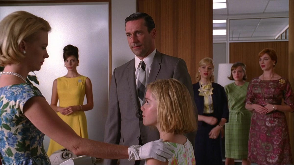
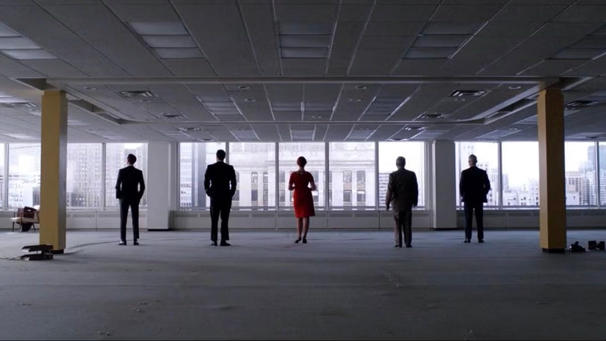
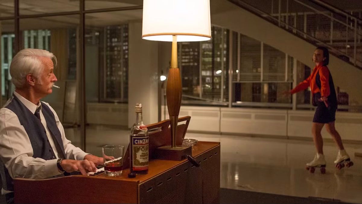
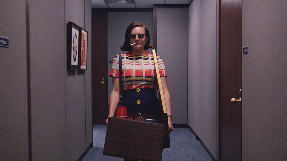
I’m carrying on with Mad Men because it’s a piece of art in 92 episodes.
I hadn’t rewatched Mad Men since it finished airing in 2015. I remember really liking it then, but I never had the urge to watch it again. Then towards the end of last year someone shared a few subtitled stills from the show that made me chuckle and made me want to revisit it. Now it’s one of my favourite shows ever.
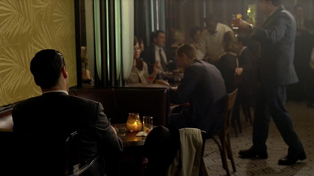
There isn’t much about the show I don’t love: it’s superbly written, acted, and directed. Some shots are so beautiful as to be movie worthy. The soundtrack is excellent. The social commentary, still relevant. Oh, and it’s very funny!
It’s also no secret that the show runner, Matt Weiner, made sure all the details were thoroughly researched to be accurate to the period. The production design team understood the assignment. A show full of mid-century modern design and 1960’s fashion, what’s not to like?
I could go on and on about all the merits of Mad Men (and please write to me if you’re the same), but I’ll let some still from the show speak for me.


You can follow my illustration and graphic design work here.