

The Making Of

At this time of year I miss my family’s sugar shack day. A day of fun for kids and adults alike, building on the family lore. Ask any aunt, uncle or cousin of mine and they’ll have a lovely story about this yearly sugary meeting.
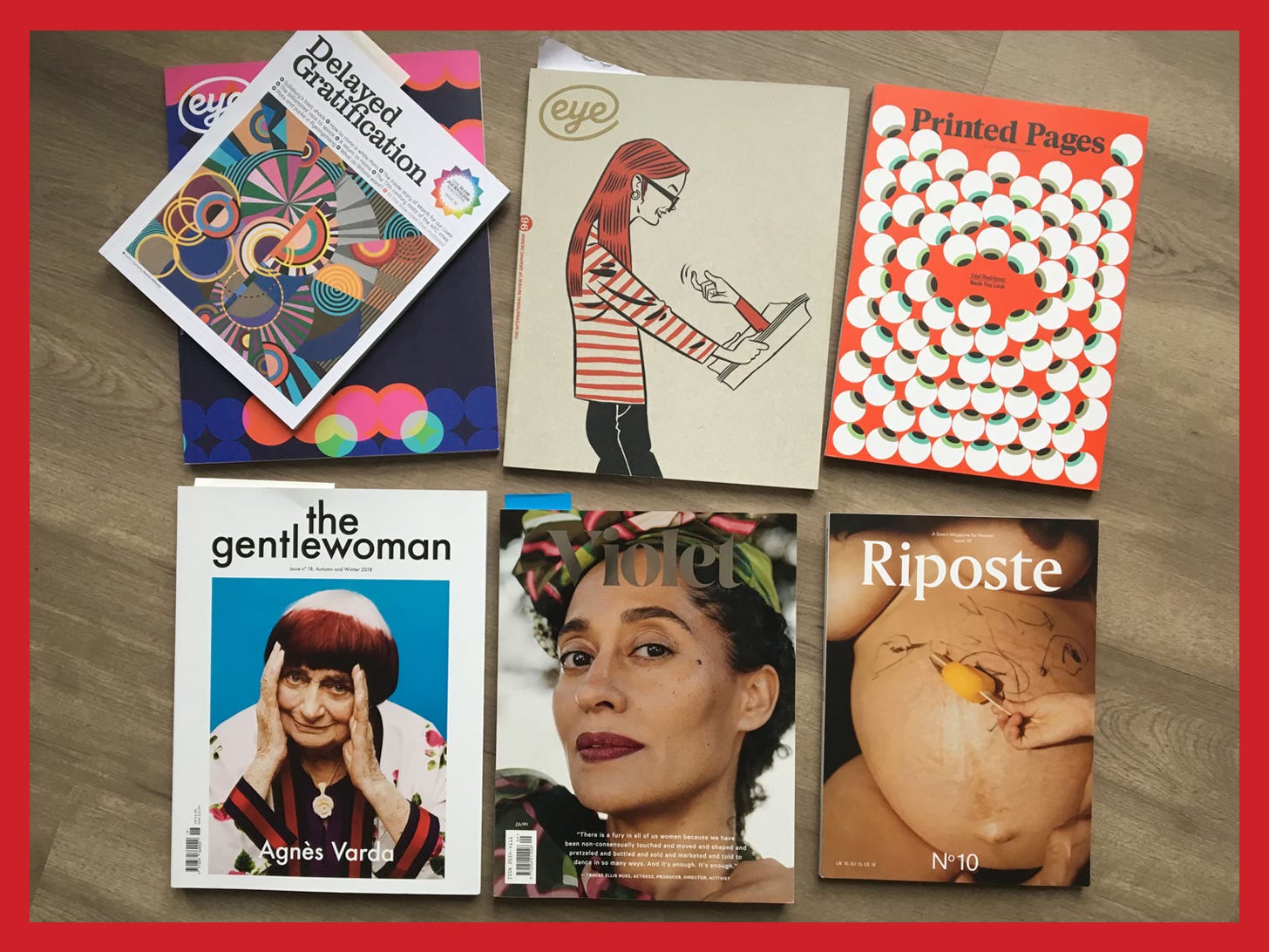
Some of you know this already, but back in 2018 I made a small magazine about sugar shacks and maple syrup. I recently found a presentation I’d done at work about the creative process behind it, which brought back good memories (and a few chuckles).
It seemed fitting for Inspired, so here it is.
Note: Some people might have a clipped version in their email, just click ‘View entire message’ when you get to it. Don’t worry, it’s mostly images.
Why a magazine?
#papersnotdead
I just love magazines. I love learning about new people and subjects, and I’m a very visual person.
A magazine encompasses most things I like about design: layout, photography, illustrations, typography.
Also, I briefly wanted to be a writer when I was a kid so I thought it’d be nice to rekindle my love of writing (it was). I thought it would be easy enough to write a magazine (it wasn’t).
Why Sugar shack?
You can take the girl out of Québec but not Québec out of the girl
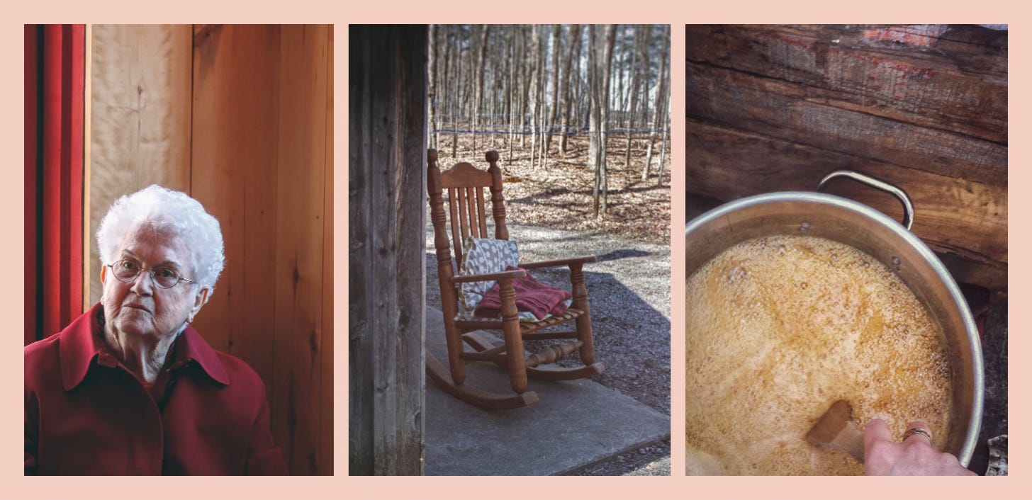
It was March, the beginning of the sugar shack period, and I was feeling nostalgic. Besides, I had a few images I’d taken in the past, it would be the perfect place to use them!
The how to
(Very) slowly, but surely
1. Planning content and finding a name
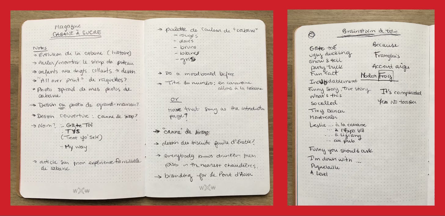
The name must have been love came from trying to convey that this theme, and all potential future magazine themes, are subjects I care about. The fact that it makes me want to sing the Roxette song every time I read it is just an added bonus. Any song that prompts you to close your eyes and make a fist with emotion as you sing along is a good song.
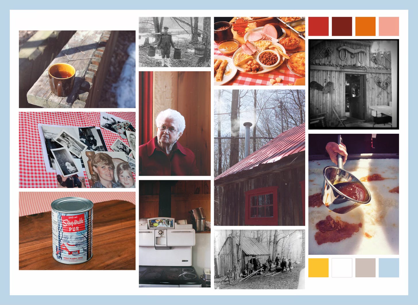
2. Setting up a colour palette and a mood
3. Getting layout inspiration
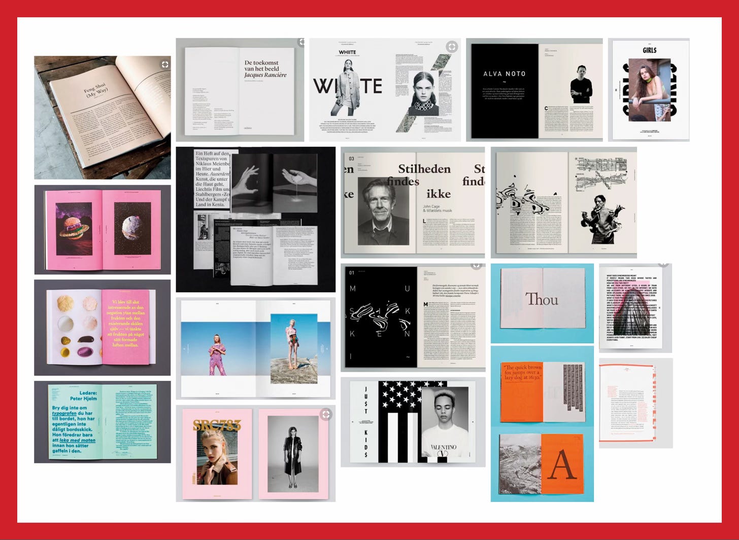
I also looked at physical copies of my favourite magazines at home.
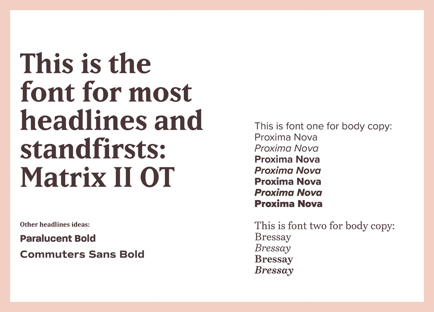
4. Choosing fonts
5. Research

Actual footage of me researching on the internet.
6. Writing for my magazine
What I thought it would look like…
What it actually looked like:
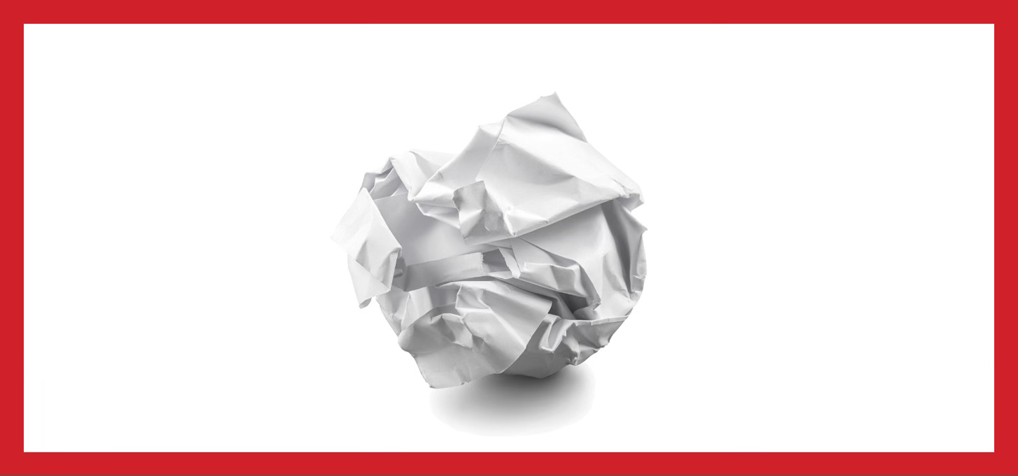
1st draft was shit.
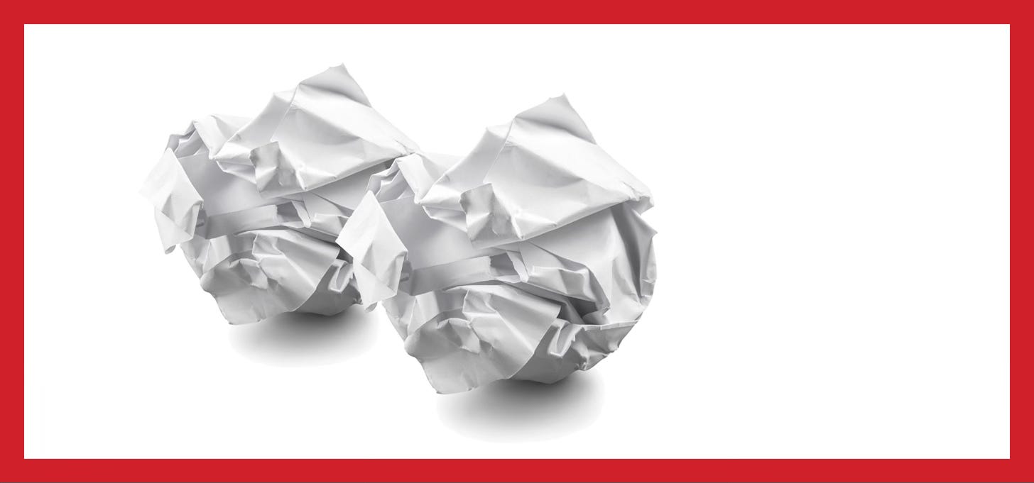
2nd draft wasn’t much better.
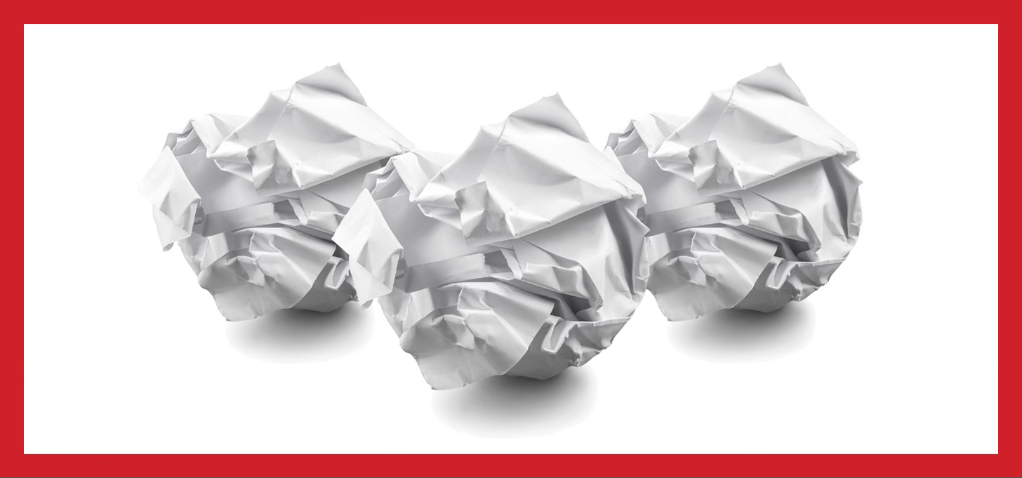
3rd draft was getting there, but still needed some work.
7. Editing the final draft
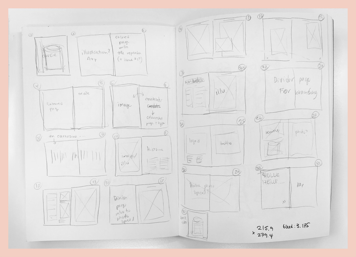
8. Planning the page layout
9. Coming up with an interesting idea for the cover

10. Planning the cover photo shoot
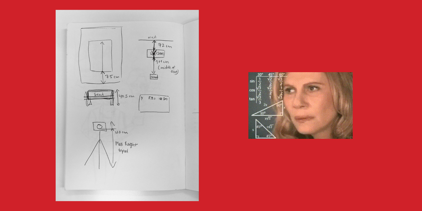
11. Doing the cover photo shoot
And sniffling maple syrup all afternoon

I’m still grateful to my then colleague Katie for taking the pictures and bringing me paper towels when I spat out maple syrup everywhere. And for waiting until afterwards before laughing at me.
12. Enrolling contributors
Having talented friends is the best
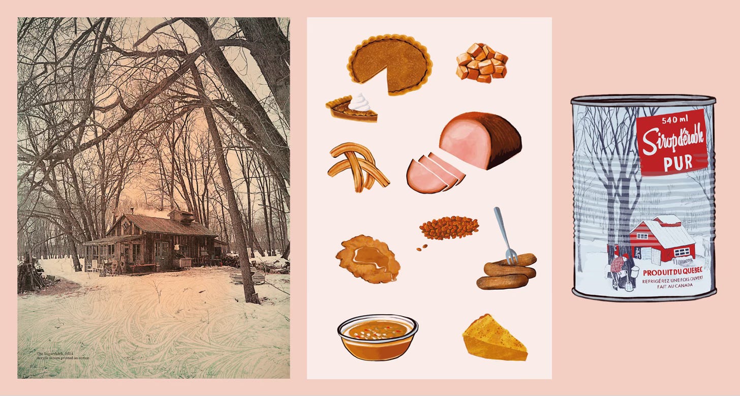
Left image: A friend from Québec, Jason Cantoro, had done this screen-printed artwork of his family sugar shack and very kindly offered to let me use the image!
Middle and right image: A lovely illustrator friend from London, Léonie Flower, also offered to help, so I commissioned her to draw food and the maple syrup can. She did a stellar job!
13. Deciding that a comic strip is a good idea
How hard can it be? Lolz
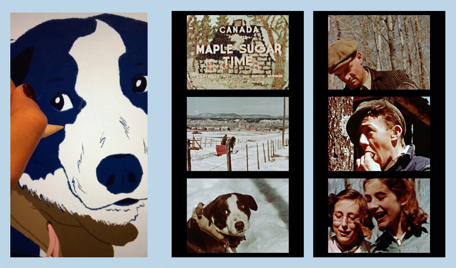
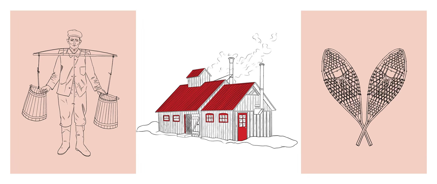
I wanted a visual to go with the history of the sugar shack. At the same time I thought I was missing information as to how we actually make maple sugar. The solution came from this 1940’s documentary. I loved how it looked. I drew a few chosen scenes, which took FOREVER.
14. Making sure the flow is good
And the colour palette consistent
15. Messing up your page count
Means having to do last minute illustrations
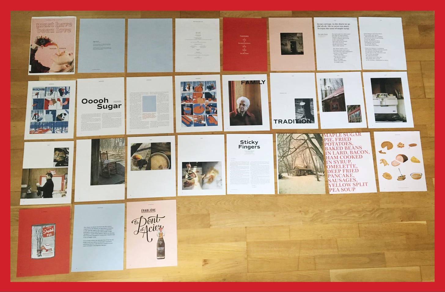
16. Aaaaand done

I’m still very happy with this project. It was a lot of work, but equally a lot of fun. I’d love to do more of them.
You can read it online here: must have been love
Judith xx
Judith, this is so cool!! thank you!