Based on most of the illustrations I sell on my shop and the many recommendations I’ve given in this newsletter, it’s no secret that I love books. They’ve been a constant in my life ever since I can remember (except for a 5-year period in my 20s when work, making clothes, and TV took over). When I was a kid, books were the only purchases my mum always said “yes” to. My love for a well-designed book started then. Remember those educational books with the transparent sheet that had a ‘reveal’? Weren’t they amazing? As I grew older and the illustrations and interesting page layouts disappeared from inside my books, I transferred my interest onto the book covers.
I first learnt that book cover designer/illustrator was an actual job when I was 10 or 11 years old. A woman came to my primary school to talk about illustrating the covers for her author mum’s books. She may have been a nepo baby, but I liked her work. And she made it sound possible to draw for a living. I was fascinated, but for some reason I quickly forgot about that career option.
I started thinking about it again last year and decided to do something about it. Seeing as I’ve been drawing again for 6 years now, and I’m graphic designer, I figured I have the right skillset. Never mind trying to get into a new industry, yet again, at 42 years old...
We all know the classic vicious circle where you can’t get hired to do something because you’re never given the chance to prove you can do it. So, I decided to create a portfolio of self-initiated book cover projects. I’ve done one so far. I thought it would be interesting to talk about the process behind it.
My Brilliant Friend
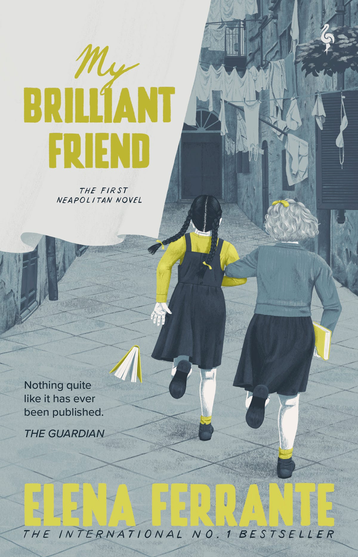
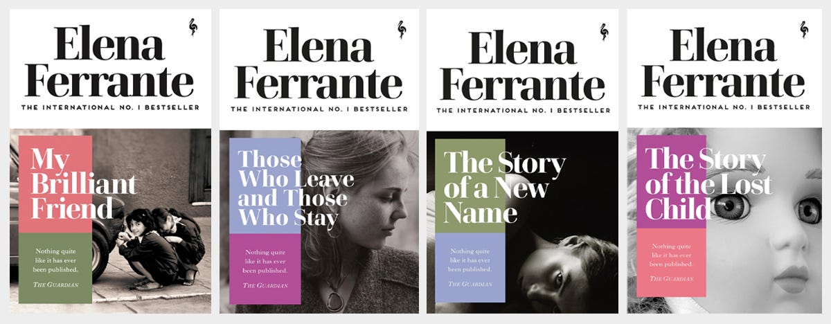
My Brilliant Friend by Elena Ferrante is the first book of the superb Neapolitan Quartet. I chose it because a) it’s an amazing story and b) I’ve not found any satisfying covers out there, in bookstores or online. Might as well do my own version!
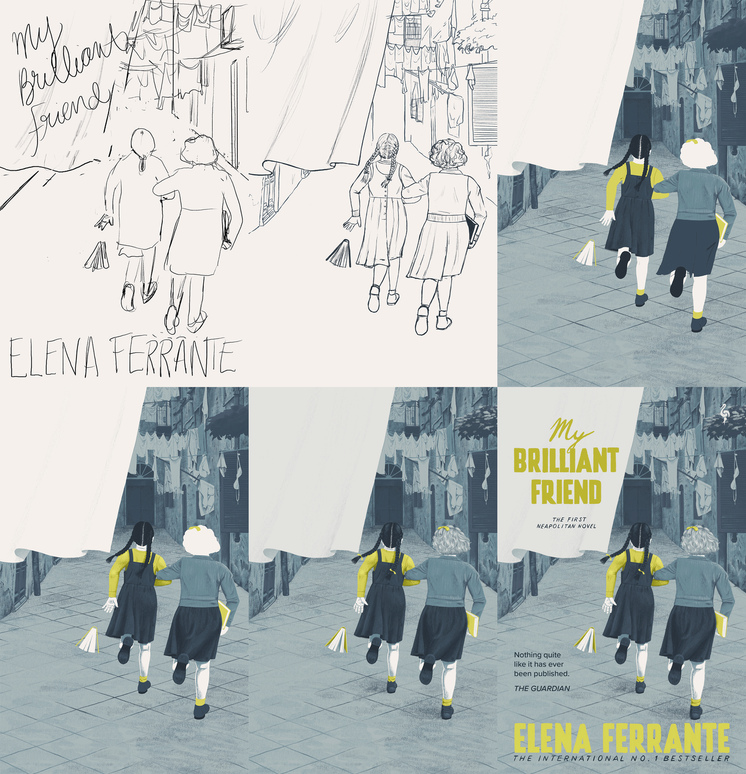
Here’s the process, broken down into a few steps:
Step 1: The idea
I wanted to show the two main protagonists—Lenu and Lila—as the story revolves around their relationship. Linking their arms to illustrate their closeness. I hid their faces to let the reader imagine them, an important part of reading, with the girls running away from the viewer. Lila, shorter and skinnier than Lenu, in the lead.
Without giving too much of the story away, the girl dropping the book is symbolic.
Set in the 1940’s in a deprived area of Naples, the buildings and overall look of the street needed to reflect this. I found many images of Naples from that era showing clothing lines hanging between buildings. It gave me the idea to have a drying sheet blowing in the wind in the foreground, onto which I could place the book’s title.
I established a rough composition for the illustration and the type.
Step 2: The cleaner sketch
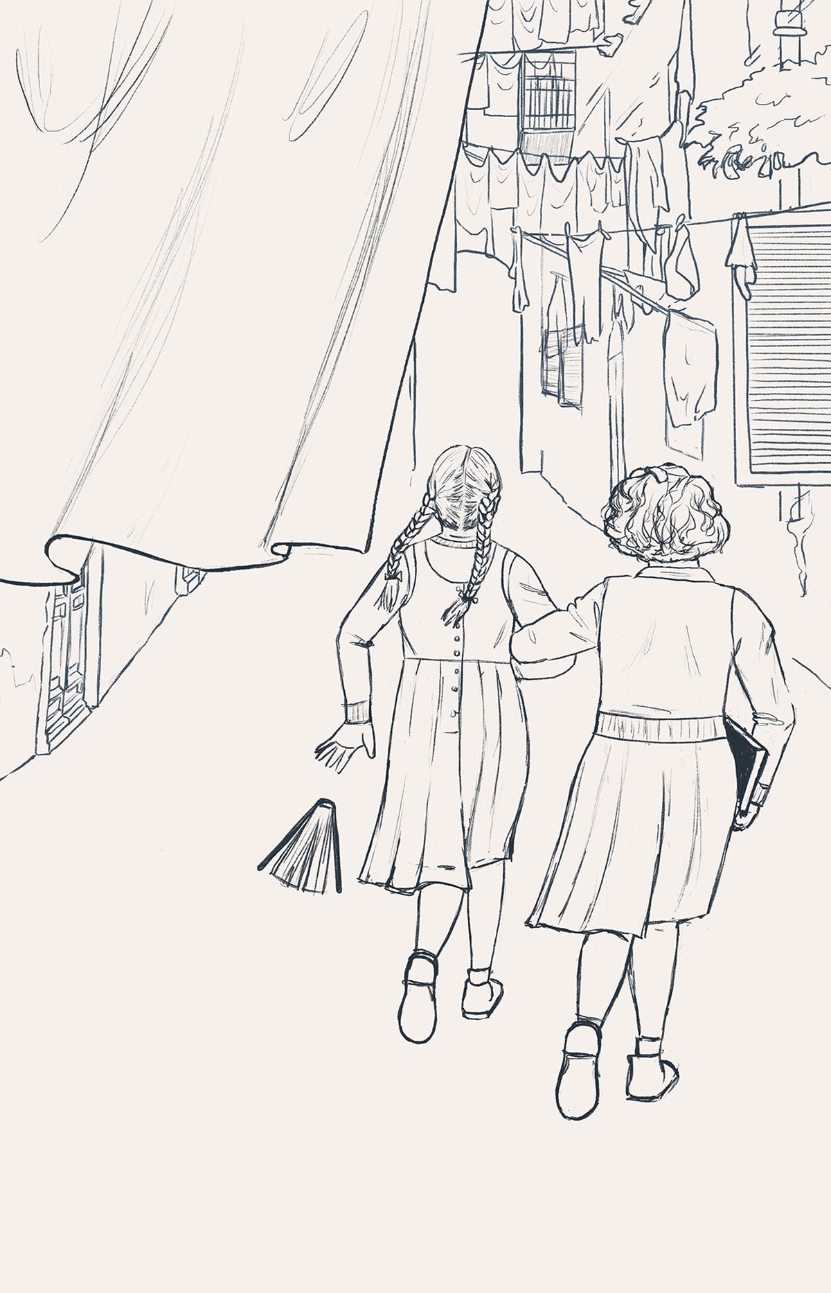
This sketch was meant to be the final composition and the details were pretty much locked-in at this point… For the background anyway.
I began thinking about the specifics. The girls had to be dressed in simple frocks. Being working class, their parents wouldn’t have had the money to provide them with dresses full of detailing, or anything that would use a lot of fabric.
In the same vein, the buildings shouldn’t look pristine. Thankfully, I found a great reference photo for the background.
Step 3: Thinking a bit more about type
Paperback editions always have a quote on them, so I made sure there was enough space to add one. I was still playing with how exactly to make the title fit. I didn’t help myself by choosing to write it on the sheet, with the smallest space at the bottom where the longer word would be. I decided it was going to be a problem for future Judith to solve.
Step 4: Asking your partner for feedback and begrudgingly agreeing with him
While drawing the final illustration, I showed my partner to get his opinion. He told me the girls didn’t look like they were running. He was absolutely right, of course, but it was annoying at that point in the process to have to change something this major. It meant more research to get the body position right, and obviously more time to change the illustration. Thankfully, a digital illustration is much quicker to change than a traditional one. Especially when you work in layers, which I do.
With the background 98% finished, I made the decision to add a bra on a clothing line (which was actually on the reference photo), referencing the fact that in the course of the book the girls become teenagers. I also decided that the door at the end of the alley would be shut. What’s behind it, the girls’ future, is still unknown to them and full of possibilities.
Step 5: Trying to get the clothes right (again)
When I started drawing the clothes in more detail, I struggled with how the skirts should look. Cue more research to see how fabric behaves when someone runs in a skirt. There were loads of pictures, but none that were from exactly the angle I needed! I had to extrapolate from a few different photos.
Step 6: Will I ever get the movement right?
Turns out deciding to add more movement was opening a can of worms. Now Lenu didn’t seem to be sufficiently in motion, so I made her hair flow to one side. And she needed to look like she was being dragged by Lila, who’s the driving force of the pair. I also realised that Lila’s head should be bigger, because kids have bigger heads in proportion to their bodies than adults.
It seemed like every time I started working more closely on one element, I had to change it from my initial sketch (the angle of the feet, the way Lenu was holding the book, Lila’s hand, the sole of their shoes…). That’s what happens when you don’t plan every single thing before you start. But sometimes you’re just in a hurry to get to the fun part and start drawing.
Step 7: Aaaand done
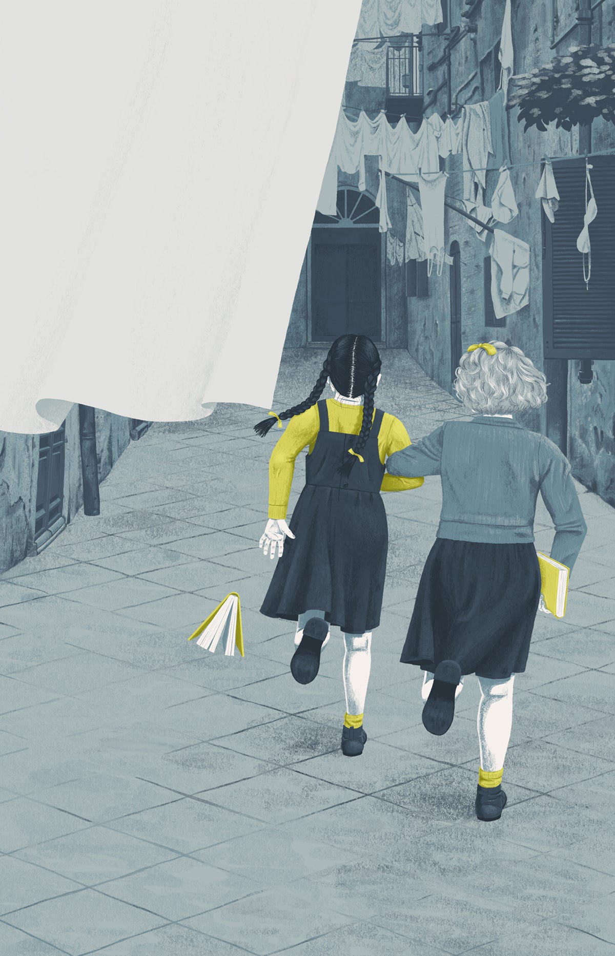
Well, the illustration part anyway. I’d kept the hair and tree leaves until last. The hair because I was dreading getting it right, especially the curly hair of Lenu. The leaves simply because I didn’t feel like doing them sooner, haha!
It was now time to add the words. I was relatively happy with the below solution, but my unofficial art director (partner) suggested I should look at Italian posters from the 1940’s to get some inspiration… He was right, once again.
The poster examples I found were handwritten and so had slightly uneven lettering. Often mixing script, all caps and italics, they were all over the place font-wise. A sign that the International Typographic Style hadn’t taken over yet at the time. In any case, I loved that mix So I drew the words by hand with in a mix of styles. I did type the quote though, but now I’m thinking maybe I should have drawn it too?
So there you have it, the finished book cover. I probably need to create many more, including some that aren’t going down the illustration route, before I’m taken seriously by art directors in the publishing industry!
Judith xx
Book recommendation
I thought I’d already recommended the Neapolitan Novels, but turns out I didn’t?! Consider it STRONGLY recommended. It’s so good it made me sad I couldn’t read it in its original Italian.
And don’t be discouraged by the index of characters at the beginning of the book, it’s just there as a reference. The story is easy to follow.
You can follow my illustration and graphic design work here.
You can visit my shop here.






Love this Judith. You should send it to Elena’s publishers for their next reprint Xx